one thing.Temu · coupon pop-up event
✳The Gift Card Trap: untangling Temu's coupon maze
A $20 coupon turned a $51.14 chair into a $151.34 checkout. I found seven dark patterns and rebuilt the flow as three honest steps.
(1 week)
A class project that started with one bean bag.
Say “dark pattern” to me and the first app I think of is Temu.
This was Project 1 for Dark Patterns, a class where we spent weeks learning to spot manipulative design, and, honestly, how to use it. The brief: take a real product and redesign it the ethical way. So I opened Temu.
I only wanted one thing: a $51.14 bean bag chair. Then a $20 coupon popped up, and I tapped it out of curiosity. A prize wheel. A “$1,000+” reward. A countdown to upgrade it. Five free gifts with no prices. A 20-day check-in. Three “Wait, don’t leave!” screens.
Fifteen minutes later, checkout said $151.34, about three times what I came to spend. I still wasn’t sure what was in my cart.
No single screen lied much. Together, they made leaving hard.
How might we keep the coupon promotion while letting shoppers see the price and leave anytime?
Seven tricks, one frame.
Hover a card to see where it hides.
Each screen misleads a little. Stacked, leaving keeps getting harder.
Sneaking
Key rules appear only after you’ve invested time.
Interface interference
Bright buttons forward, grey links out.
False urgency
Countdowns on rewards that never expire.
Fake social proof
“Others are claiming right now.”
Preselection
Gifts come pre-picked.
Confirmshaming
“Give up $1,000+?”
Fake reference prices
Struck-through prices that never existed.
Strip the goofy stuff. What’s left?
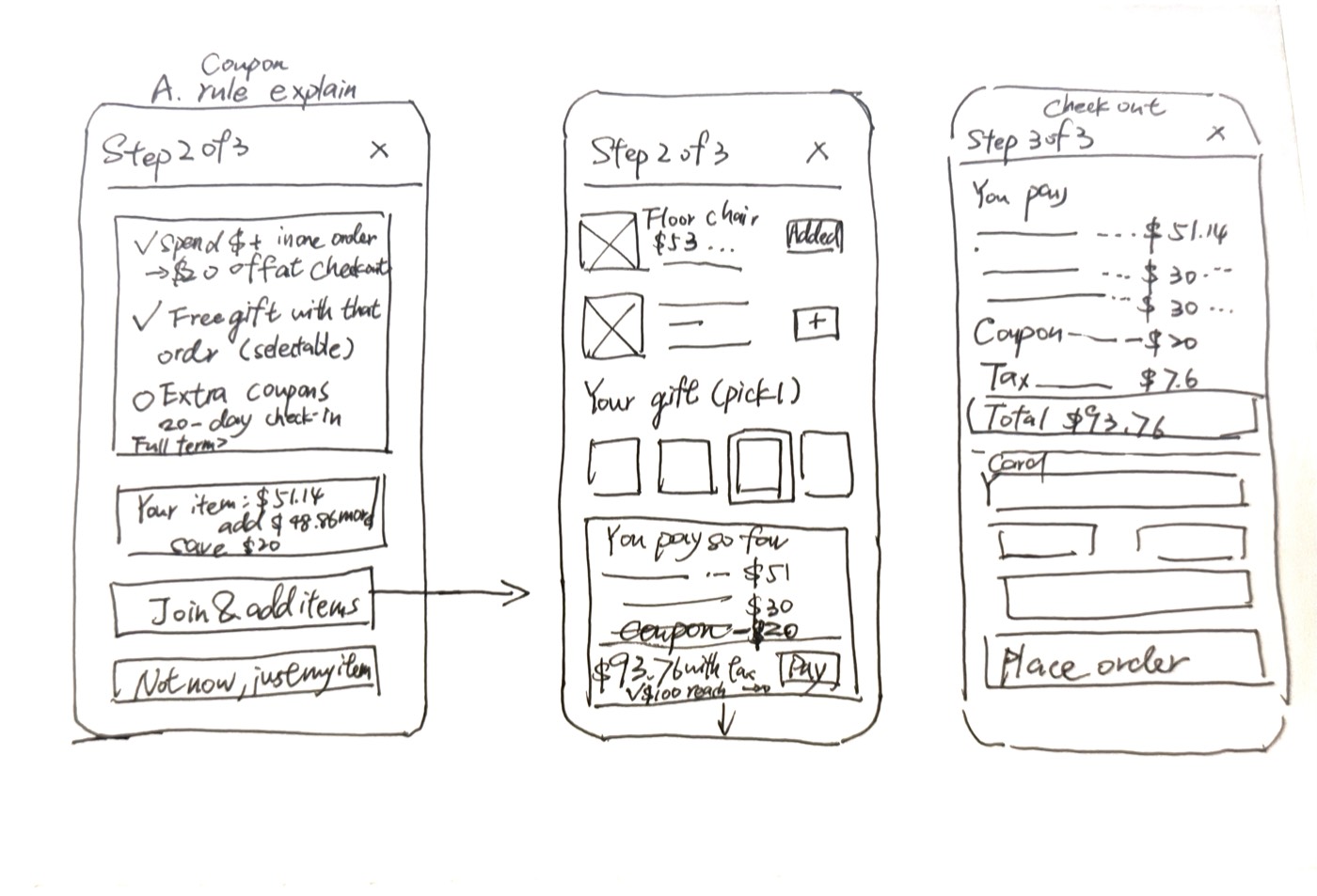
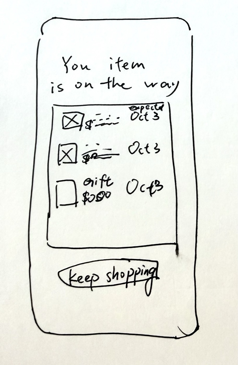
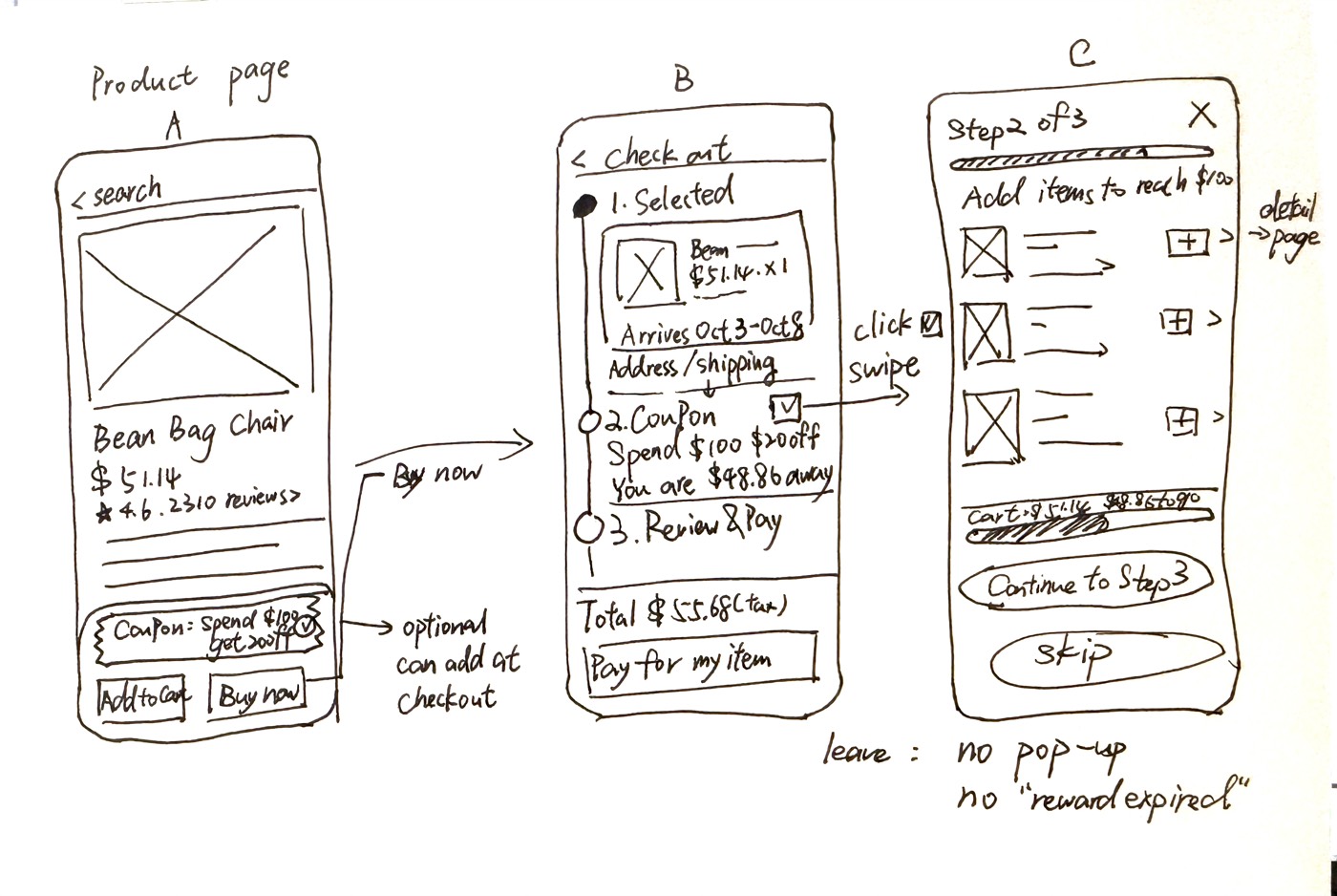
The item comes first.
The coupon is an optional note. Leaving is always one tap. This phone is my live prototype: it tours itself, and you can tap it.
Price visible from step 1.
Same offer. The difference is when you see the price.
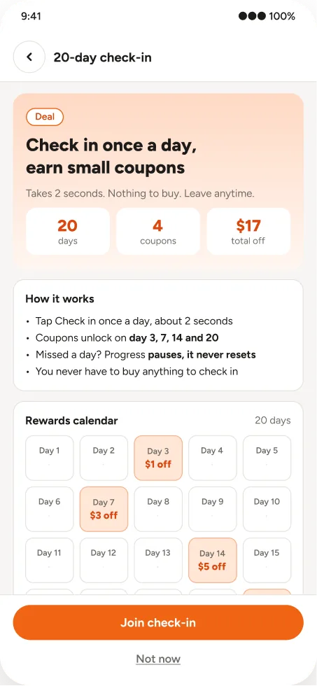
Keep the check-in. Make it a choice.
Daily check-ins are a fair way to bring people back. The trap was hiding one, pre-checked, inside the coupon. So I kept it, off by default and separate from the order.
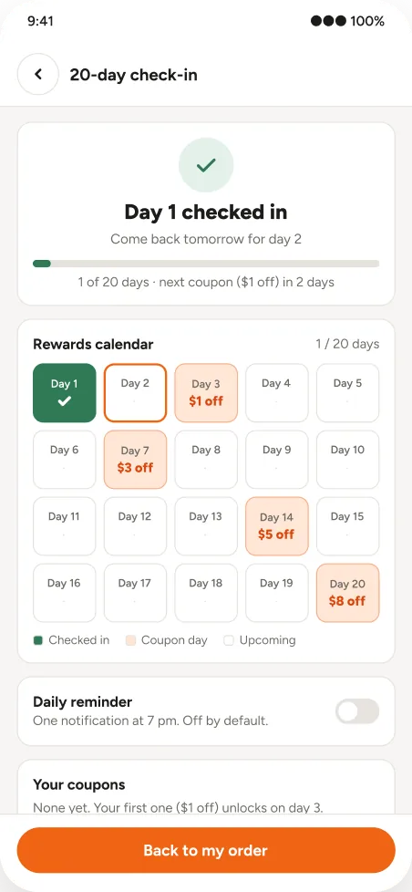
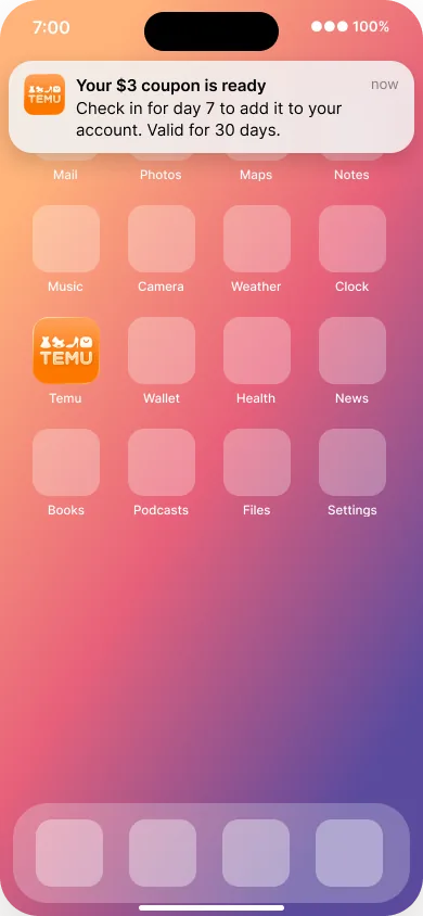
Ask for notifications in context, then keep the promise.
iOS asks for permission only once, so an in-app sheet explains first: one a day, your chosen time, no ads.
The benefit is the title. Action and expiry in the body.
References: Apple HIG “Asking permission”, App Store Guideline 4.5.4, Duolingo and Starbucks notification patterns.
Same cart on desktop.
A first concept. Same pop-up checkout as Temu’s website, made honest: the real price, an optional coupon, and one calm “leave?” check. Try Buy now.
MUbean bag chairSynced with appOrdersCart

Jumbo Plush Bean Bag Chair for Adults with Head and Back Support, Extra Large Durable Tear-Resistant Fabric
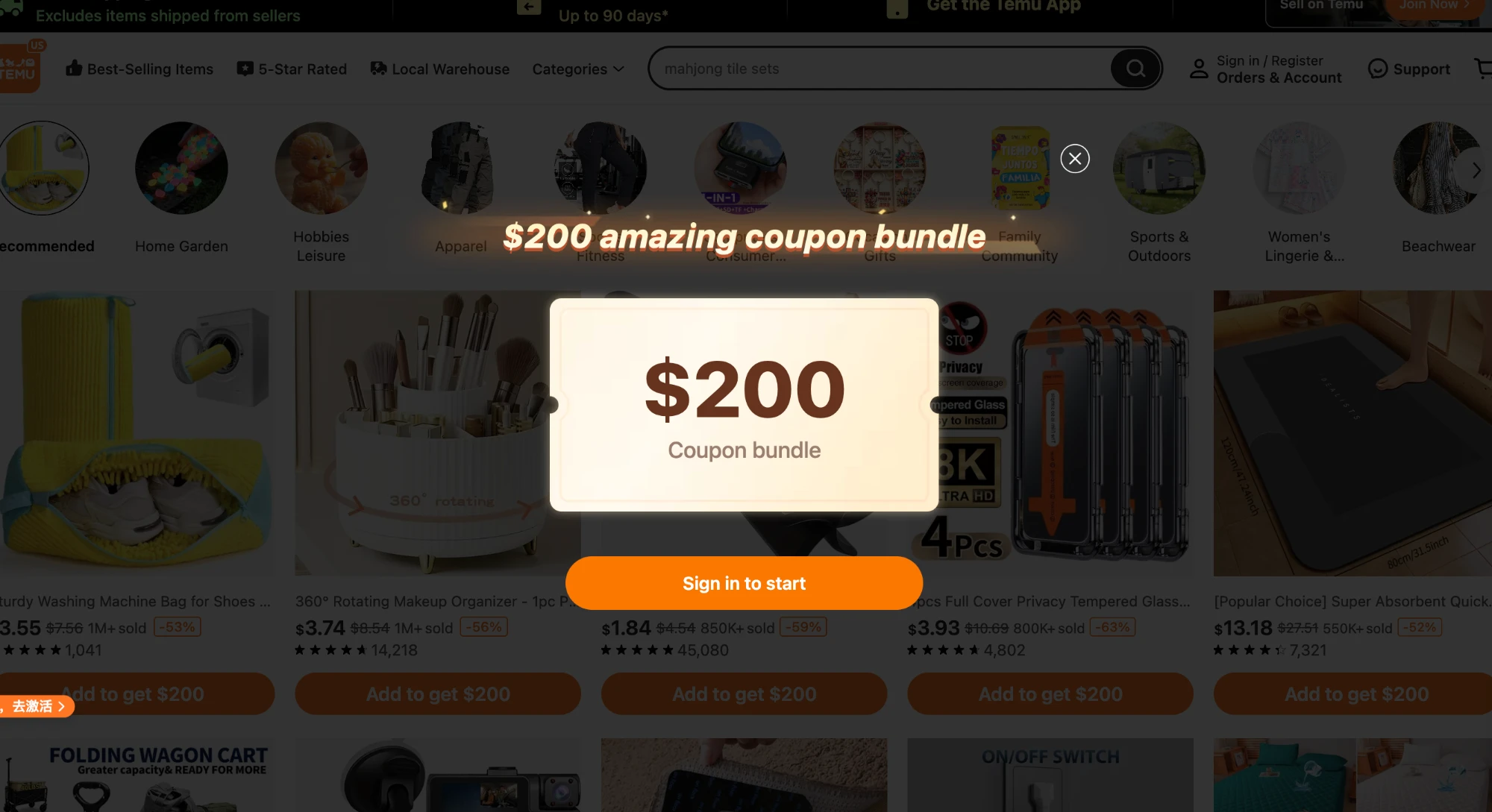
First shown on screen 16.
Visible from step 1, updated live.
Honesty costs a little. Trust pays it back.
- Fewer impulse add-ons.
- Some refunds once people see what they bought.
- Shoppers return on purpose.
- Fewer surprise packages and returns.
- Less risk under FTC click-to-cancel and the EU DSA.
Seven patterns, three steps, one chair.
Is the redesign actually better? 15–20 people try both flows with one task: buy only the bean bag chair.
I compare completion, taps, what they paid, whether they knew what they paid, and trust. Half see Temu first, half see mine first.